

Slow Looking: The First 30 Seconds
A beginner's guide to seeing art
Behind the Masterpiece is a free newsletter. If you like it, consider supporting it financially. For only $5/month you’ll get my deep-dive art history series, access to reader Q&As, and a direct line to me to ask your burning art history questions, or for museum recommendations. My work is 100% reader-supported, hence the lack of ads or sponsors. Thank you for being here!
Also my Art History Dictionary is officially live for all paid subscribers.
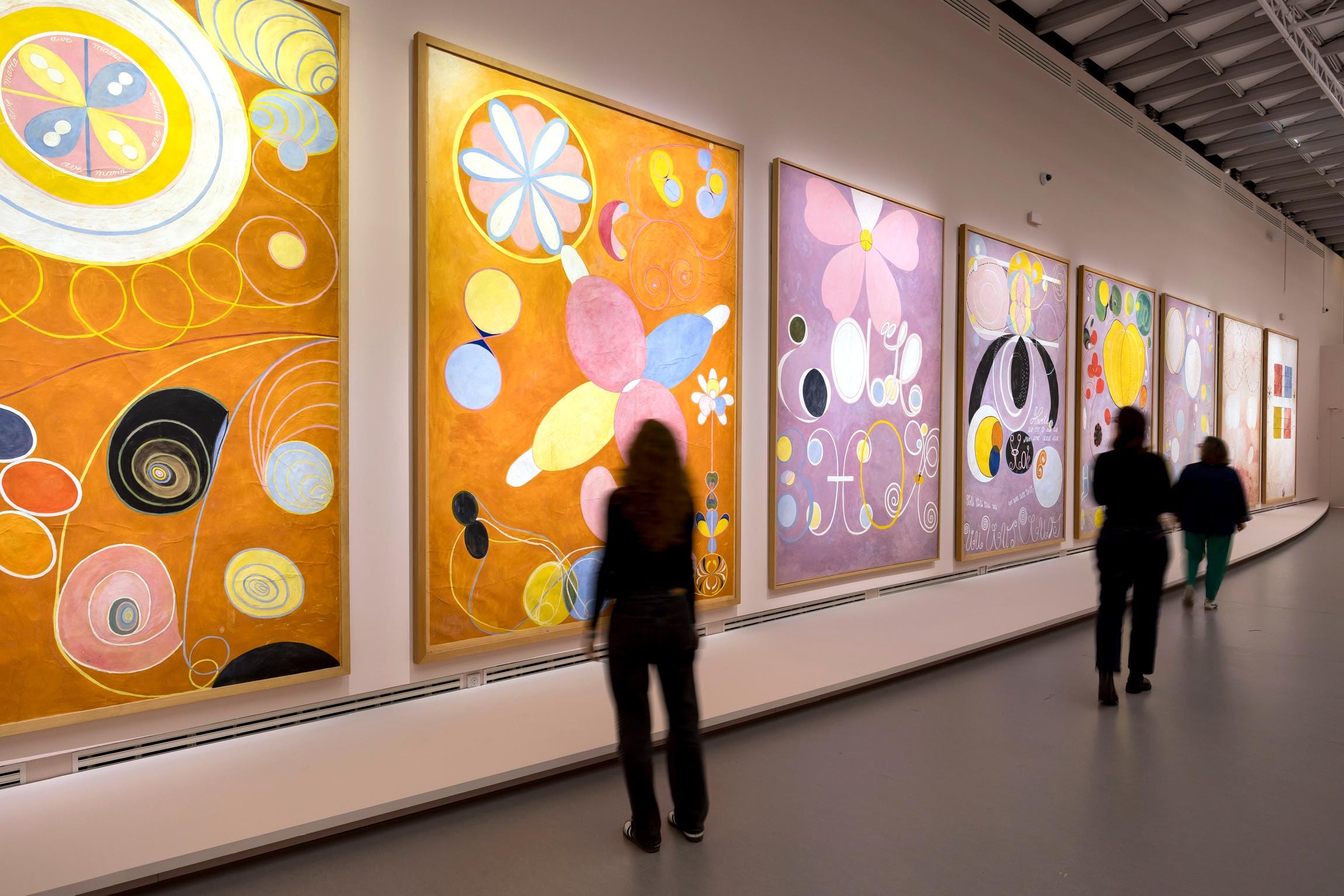
Walk into any major museum and you’ll see the slow shuffle down a corridor of masterpieces; everyone’s eyes flitting from one frame to the next in quick succession, phones raised ready to snap a pic. Then, as quickly as they came, it’s onto the next, and so on. It resembles looking, but it’s not really.
In 2001, researchers at the Metropolitan Museum of Art timed how long visitors spent in front of a piece of art: averaging out to 27.2 seconds. But the median, unaffected by outliers who spend 20 minutes sitting in front of a painting, presented a more honest number: a mere 17 seconds.
Sixteen years later, a follow-up study at the Art Institute of Chicago found almost the exact same results: an average of 28.6 seconds, and a median of 21 seconds. It’s wonderful to see that both numbers increased, though it’s not by a lot, is it? The takeaway remained the same: most people give a painting less time than it took you to read this paragraph.
This isn’t any one person’s fault, it’s a design problem of these institutions. Dropped into a large and unfamiliar field of information and visual stimulation and left without a strategy, our eyes do not know where to start. So it’s very realistic to default to quick, shallow glances that ricochet unconsciously around a canvas and retain just enough to feel ready for the next painting. What ends up happening is that you leave the gallery having seen a great deal, but absorbed almost none of it.
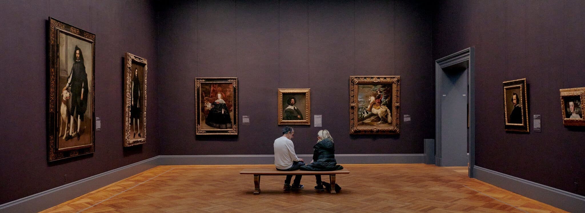
And there is another problem that I personally experience which often gets overlooked: Looking at a painting is overwhelming.
Even if you’re lucky enough to have the room entirely to yourself, without someone walking in front of the painting you’re trying to look at (which is about as likely as being struck by lightning), you’ll find that with no one else talking, moving around you, or unintentionally giving you the social cue that you should probably move on and make room for someone else, there is still a lot happening.
So let’s stop, and just find one painting in the room. It doesn’t matter which one you choose, it’s the right one. Imagine it is spotlighted in your vision and let the rest of the room fade into your periphery as much as possible.
The good news is that you and the canvas are not entirely on your own. The artist, whether they were working on this piece months ago or centuries ago, made decisions with a viewer in mind, with you in mind.
Don't worry about knowing what you're looking at, not yet. You don't need to know the artist's name, the date of completion, the medium, the symbolism, the politics, or the history behind the work. You don't need an art history degree to look. Your job, in these first 30 seconds, isn’t to see the whole thing, it’s just to find the door.
This is Part 1 of a 4-week series about the art of seeing. While this first installment is 100% free for everyone, Parts 2 through 4 will be exclusive to paid supporters.
First 10 Seconds: Find the Focal Point
Resist the urge to scan the whole canvas at once. Instead, notice the point where your eye feels most comfortable landing on first. I would bet that in the majority of canvases, this would be the focal point. Maybe it’s a face, or a hand, a bright patch of colors, a dramatic spotlight within the darkness, or maybe even a bare corner within it all. There is no wrong answer here. Wherever your eye naturally wants to settle is a perfectly good place to begin.
Stay there for 10 seconds and do nothing else. Grab a mental seat and let’s look together.
Next 10 Seconds: Follow it
After taking in that first point, ask where does your eye want to wander to next.
If it’s a figure maybe it’s where they’re looking. If it’s a body part, where is it pointing? If it’s a line in the architecture, where does it end? Follow the direction of an outstretched arm, a leaning body, a staircase, a spear, a shoreline. Artists use elements in the composition to guide you around their canvas, sometimes very obviously and sometimes in ways you don’t notice until you’ve already followed them.
Still, we’re not trying to interpret anything from this but just going along with the natural rhythm of the artist’s design.
Last 10 Seconds: Zoom Out
Deliberately pull your gaze away from the focal point and look at the margins, the background, and the corners. These are the things we often ignore. After all, we tend to look at paintings the way we look at everything else in our daily lives: We scan our field of vision, and find the person/object/action that is the most interesting visually, and give it all of our attention.
The margins can provide a lot of context, like where we are, what is happening outside the main action, or simply what the artist thought was worth putting there because there is a purpose in every element included.
That’s 30 seconds.
Now, let’s try this with a few paintings.
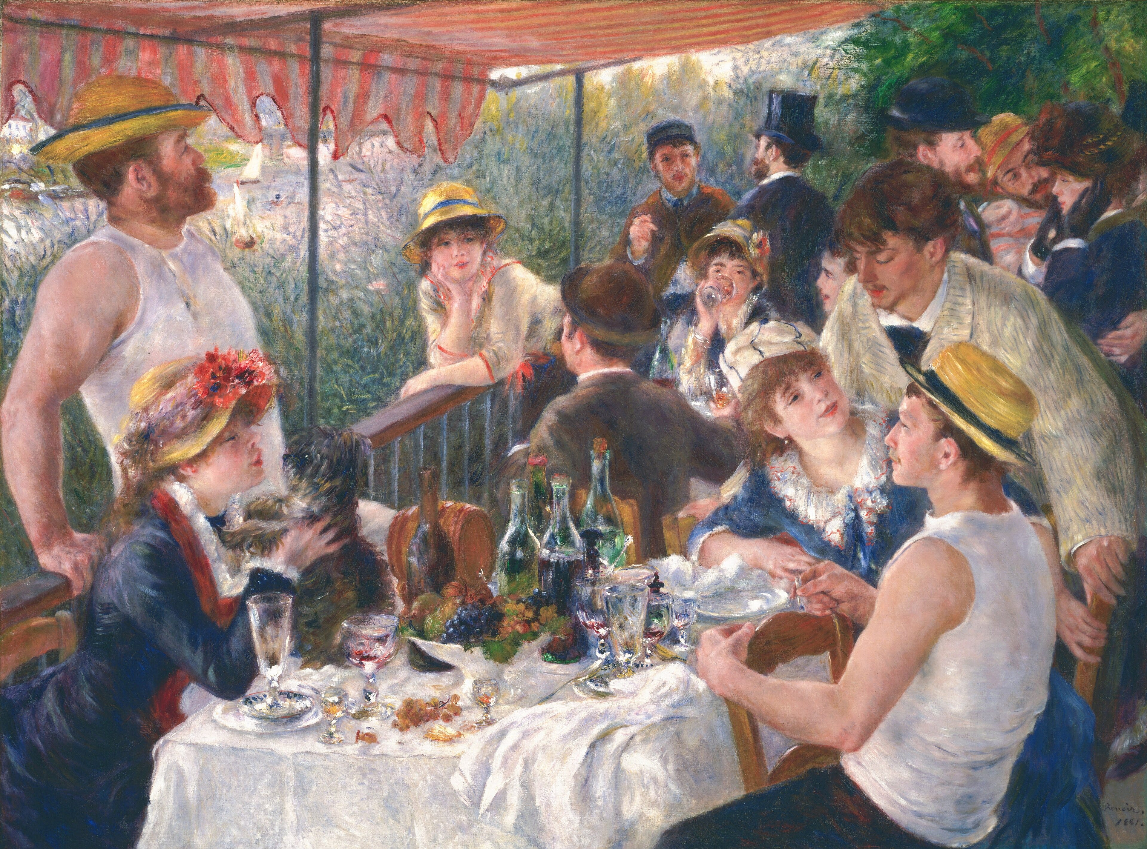
In the first 10 seconds, your eye probably bounces across this canvas, trying to find a place to land amongst the many figures. You might settle on the woman in the foreground-right, one of the few figures whose entire face is shown.
From there, we follow her gaze to the man in the white shirt beside her, whose attention is on the woman playing with the dog in the foreground-left. The bright white shirt of the man leaning against the railing then pulls our eyes upwards, towards the figures in the background. From there, the lines on the shirt of the man leaning over the table bring us back down to the group we started with, and just like that, we’ve completed a literal circle of glances.
For the last portion of our 30 seconds, move outwards toward the edges. The red striped awning, the swaying greenery, and the boats scattered across the river. Now, not only do we know what company we’re with, but where this gathering is taking place.
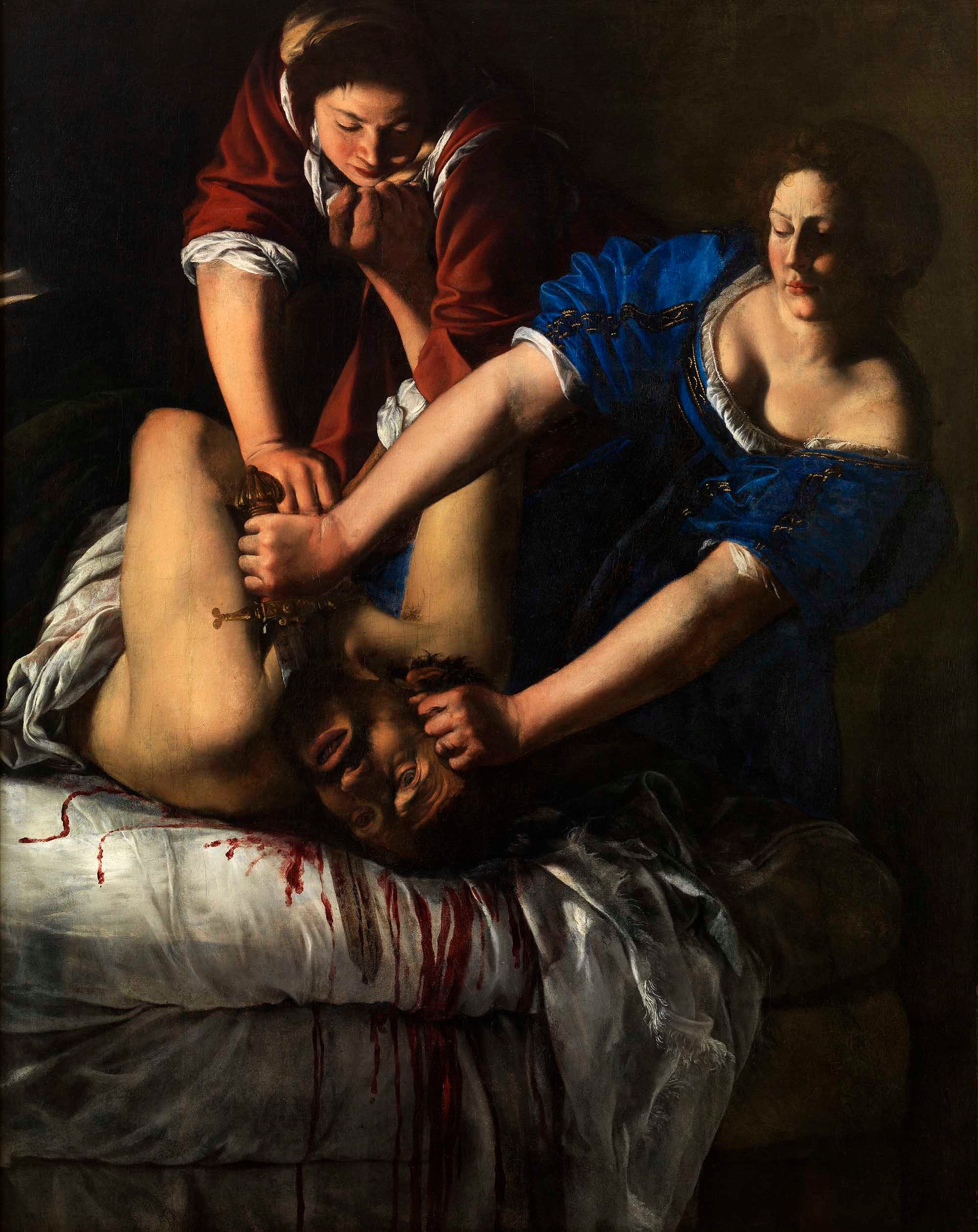
The first place your eye goes is probably the violence itself. The last bits of life draining out of Holofernes’s eyes, the blade at his throat, the blood spilling onto the white sheets. It’s quite difficult to argue that the focal point is anything else. Gentileschi has created a scene in which the central action is also the visual centre.
From there, you might follow the diagonal lines of Judith and her servant’s arms and move outwards. See how they’re leaning into the action, their faces calm, their resolve unshakeable.
Now look at the edges of the canvas, which in this case, doesn’t really provide us with more context. The dark background, the heavy folds of the blue and red fabrics, and the stained bedsheets, that’s all we have. Everything that’s usually contained within a background has been stripped away. Our three figures are packed tightly into the centre of the canvas, illuminated against the obscure background which is doing very little to compete with the foreground, and so our eye keeps returning to the same violent knot in the middle. Gentileschi could give them more room, but chose not to, and that closeness, that feeling of claustrophobia, is what forces both our subjects and us to remain with the discomfort of what is happening.
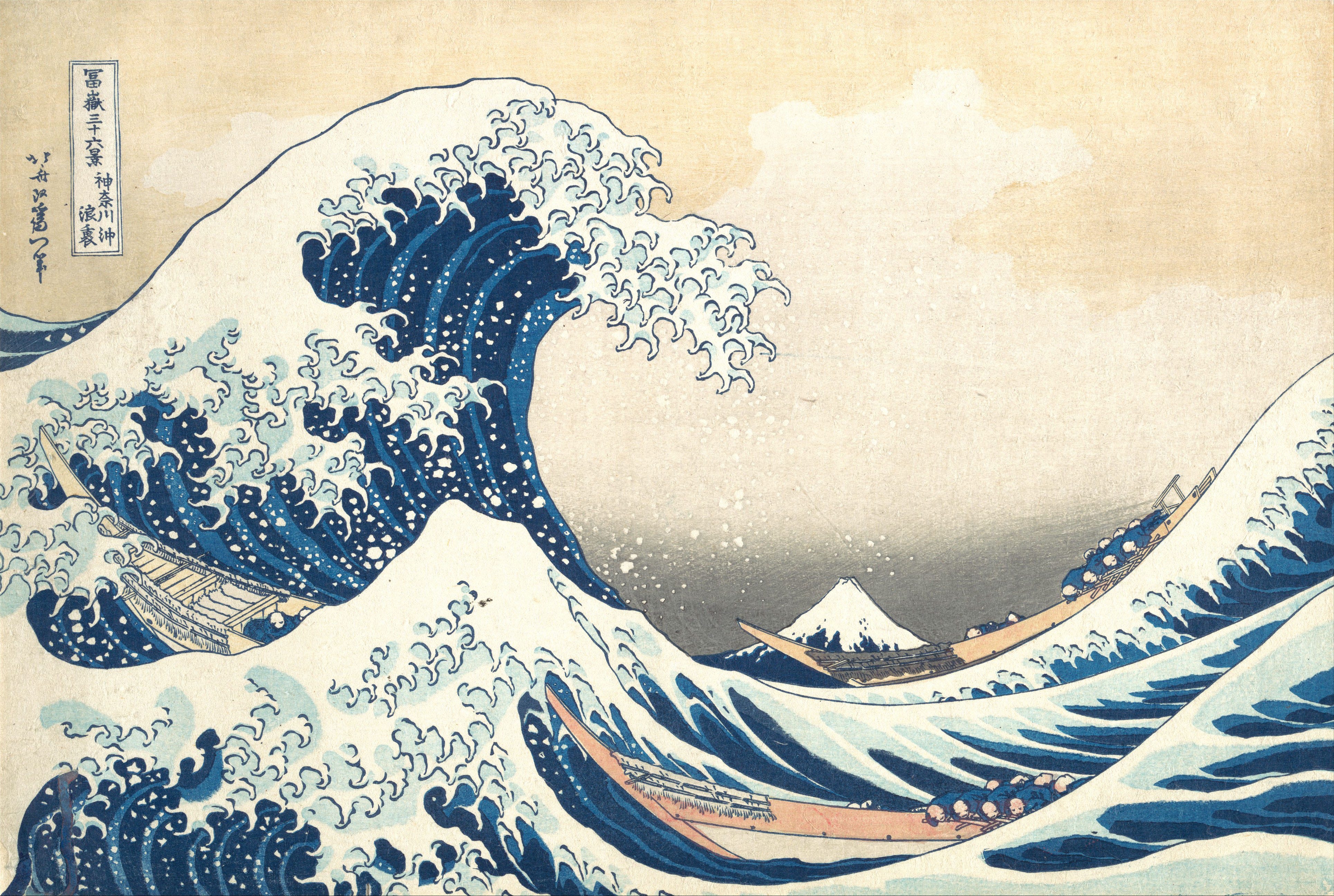
Did your eye go directly to the crest of the large wave in the left? If so, you have found the focal point. Frankly, it would be quite difficult not to be drawn immediately to its enormity, a vivid shade of dark blue with clawing white foam, curling menacingly over the small boats with people aboard.
Follow the shape of the wave down towards the boat on the left, then back up towards the second wave in the foreground, before your eye drops down again towards Mount Fuji in the distance. This mountain is Japan’s tallest peak and yet here, it is absurdly small. Some viewers even mistake the mountain for a wave. Hokusai is playing with perspective here by making the wave massive, while the mountain, so imposing in person, seems like an afterthought.
Now pan out towards the corners to the water, Hokusai’s signature, and the soft yellow of the clear sky. Notice how much of the image is actually taken up by things that aren’t the “main subjects.” Like how the sky which occupies nearly half of the image, creating the open space that allows the wave to tower above the scene.
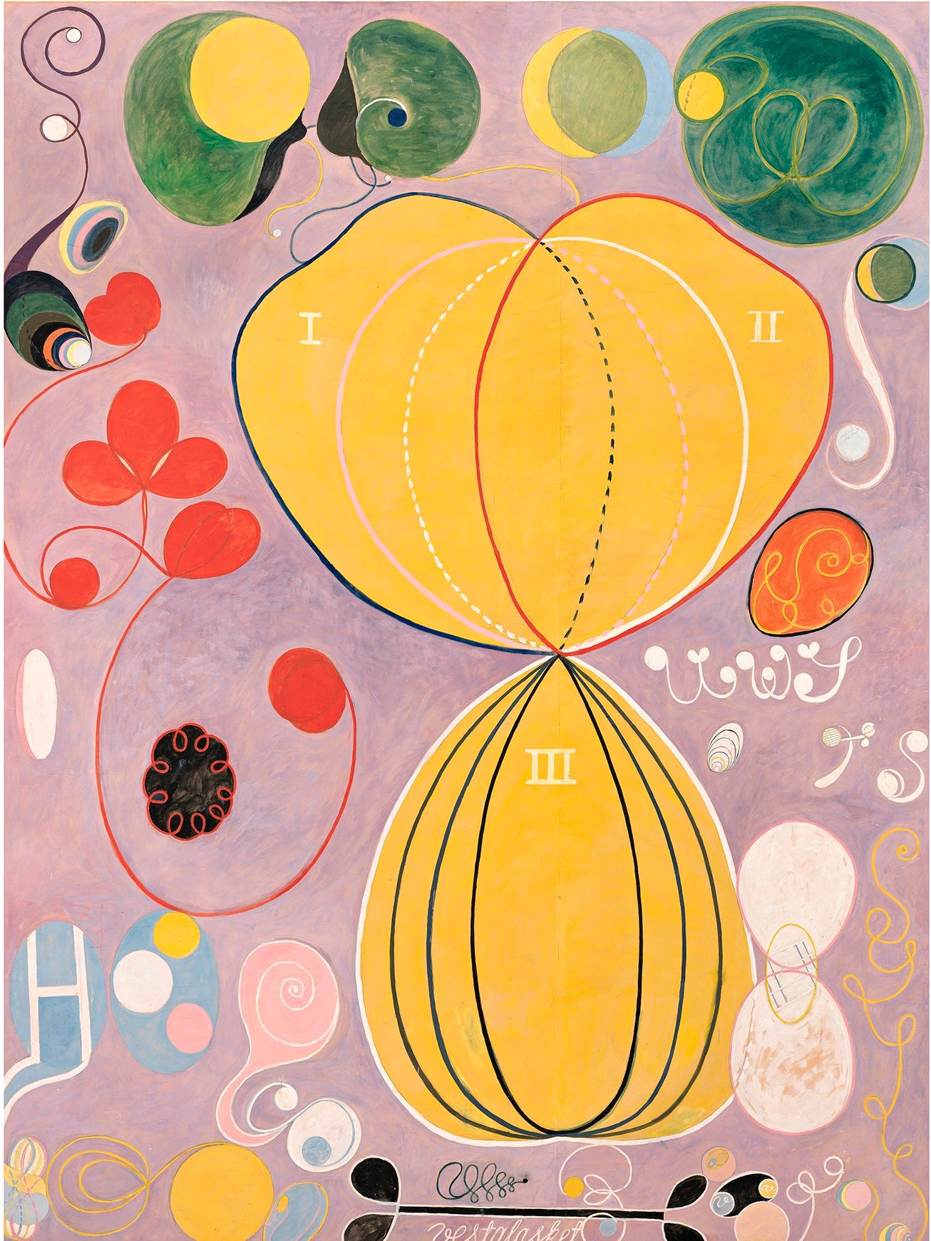
This is where our exercise gets a little harder, and that’s okay. There isn’t a figure, a mountain, or even a recognizable object for our eyes to settle on, but the exercise wouldn’t be much use if it only worked for some paintings, would it? So where does your eye fall?
Maybe it’s the large, yellow, hourglass shape in the center. Maybe it’s one of the spirals dancing without direction, or even the dusty pink background that surrounds it all. Don’t worry about choosing “correctly” because there often isn’t a single correct answer. Just stay with whatever caught your eye first. What color is it? How large is it? Is it sitting in the middle or slightly off to one side? Does it feel heavy or light? We have to get used to the painting before we can ask it to explain itself.
Now, let’s follow what comes next. If your eye landed on the yellow, where does that take you? If it was blue, what sits beside it? Does the pink pull you towards the center or out towards the edges? Maybe you find yourself following one of the spirals round and round, only to realize that you’ve ended up far from where you started. And this is where (understandably) looking at an abstract painting can become slightly irritating, since there is nothing to “find” in the traditional sense.
Moving out towards the edges of the painting, you might notice how the shapes run off the canvas, making it clear that whatever is happening here doesn’t begin or end within the frame. Look at the empty spaces between the forms too, because they aren’t really empty, they give the larger shapes room to move, to expand and to contract. Then come back to where you first looked. Does it still feel like the focal point? Maybe it does, maybe it doesn’t. But you’ve spent another 20 seconds looking, and understanding how the different parts relate to one another.
Now what?
We have not yet understood the painting in its entirety, but now we have an idea. We’re familiar with its bones, and that is no small achievement. You have already spent more time with these four paintings than the average person.
Now that we’ve worked out where to look, we can start asking why the painting looks the way it does. In Part 2, we’ll stay with the painting for the next 60 seconds and analyze its composition and color.
Behind the Masterpiece is entirely reader-supported. Each post takes significant time to research and write, and paid subscriptions are what keep the work going. If you’ve enjoyed what you’ve read, consider becoming a paid subscriber to directly support the publication and have your questions and comments featured in future Q&A’s.
Great post. Would love you to go deeper into understanding abstracts better. What makes Rothko, Pollock etc so valuable. Would love to hear your breakdown of them.
Thank you for this post. Great lesson. Looking forward to Part 2!